Project Overview

THE PROBLEM
Help people to learn new vocabulary.

THE PROCESS
01
Empathise
Competitive Analysis
User Research
02
Define
Proto-Persona
Task Analysis
User Flows
03
Ideate
Lo-fi Wireframes
Mi-fi Wireframes
Prototyping
04
Test
Usability Tests
My Role
UX Research & Ideation
Duration
2 weeks
Tools




WHO?
People who could be my targeted users are following some educational paths and nowadays they are learning new vocabularies.
WHAT?
A mobile application focused on learning new vocabulary.
WHY?
It can be difficult to keep track of all the jargon when studying a new discipline. Students need a way to methodically categorize, reference, and study new vocabularies.
WHEN?
5 to 10-minutes study sessions (on-the-go).
WHERE?
At a cafe, in a bed or on a bus, train.
Emphasise
01 Competitive Analysis
I decided to analyse 3 competitors of my app. Even if they are trying to solve the same problem, the concept of these apps looks different and inspirational for the design of my app. It was useful to understand the pros and cons of each to have a clear start for understanding the user during the user research you’ll find next in this project.

Quizlet
3.700+ Ratings
🌟 4.7 🌟
ATM’s app? Overloaded. Quizlet seems to be overwhelming for the users. It’s just a little bit confusing the first time you use this app. There are 5 different ways to learn, but the way in which are organised is not appropriate. There is a better way to reach that menu in the same app. Thus, why not re-organise them into a new menu, giving it a better structure and leaving the users to feel more relaxed?
Babbel
38.000+ Ratings
🌟 4.6 🌟
Customizations are the key. One of the most popular apps for learning by the way. Babbel it’s a really well-done app, with a clean and minimal design. I really like the clarity and the structure of the app in general. The feature that I love is helping people not to strain during each lesson and matching the word alternately (one yes and the next just keep the meaning).
Flashcards.io
11 Ratings
🌟 3.9 🌟
Tinder-structured flashcards. Flashcards.io has the same structure as Tinder’s cards apparently. But there’s a problem with their usability of them. The button at the bottom of the screen is in the opposite order of the gesture implemented for the same goal. However, the chance the app gives to the user is useful. Creating “Decks” with custom cards could be useful to collect words and their meanings, customising own learning path. The tags features appear to me like not working.
For more details about the competitive analysis click here.
02 User Research
At the discovery phase of my project, I conducted user interviews in order to get a better understanding of the problem. I’ve interviewed 5 people in blended mode (some remote and some in-person). This let me test both experiences. I’ve asked some questions to a bunch of friends/acquaintances who are studying languages, but also other disciplines that require vocabulary learning such as biology.
⏱ Maximum time: 20 mins.
Let’s go! 🚀
My Questions
(after introducing me & this project)
- Are you a student, a professional or both? Tell me more about your responsibilities / your daily routine. Describe your typical day.
- When was the last time you had to learn a lot of new words? What made you succeed or fail?
- Did you ever attend a lesson in which you have found new words? How did you feel?
- When you come across a new word what do you usually do? … focus: to memorise them?
- Where do you prefer and enjoy learning new words from (apps, social networks, videos, books)?
- Tell me about a time you were frustrated with jargon and new vocabulary. Why was it frustrating? Is there anything that could have made it easier for you?
- How much time do you spend learning new words? Why? (Also understand where)
Out of the box
My interactions in the following interviews are highlighted in bold font. As you will see, there are some questions “outside the box”, because I prefer to empathize with the users, making them comfortable and this let me take extra information too.
To see more about the interviews click here.
Combining Insights
Doing ✍
- I surf the web to find phrases and context in which that word could be used and after I try to keep in practice what I learnt.
- If it’s difficult for me to remember a word, I use it more and more.
- With my friends, I use new words with them.
- I contextualize.
- Happens to find new words, mostly since I’m reading a book.
- I usually do some kind of associations in the real life.
- I never dedicate a fixed time to learning new words.
- I go by categories.
- I highlight the new words with a different font or colour.
- Books, journals, articles and from my Professors.
- I can find the etymology of the same.
- Rarely, on the train, because I get distracted, I study at home
- I record them
- I create nursery rhymes
- I invent a new word that subdivides a part of the word into syllables.
- I study from an audio fragment […] when I walk I listen to it in headphones to train my ear and learn pronunciation.
- I use an app called Imiwa to translate words
Thinking 💡
- I like learning languages and I’m not strained.
- Teacher’s Method is useful (pronunciation)
- No, for me it’s not good Visual Memory (1/5).
- The book is not exhaustive
- It would be nice to translate some words quickly or also have a predictive app that suggests some translated words based on my knowledge.
- From generic to specific, in a useful way.
- Interactions with images.
Feeling 💛
- Approach is pleasant
- Words collected by argument, it’s difficult for me to memorize them all, some run away.
- I don’t understand 100% of words […] if I found more than one in a phrase, I feel frustrated.
- It messes me up.
- Lost.
- I couldn’t classify them in any way.
Define
03 Persona

Software Developer
Crafting my Primary Persona
Based on 5 user research, I’ve defined my Primary Persona and built my Proto-Persona, Andrés, with some helpful assumptions.
As Andrés (a Sw Developer) I want to improve listening of English so that I could do video-conferencing with Foreign Customers.
USER STORIES
AS ANDRÉS (A SW DEVELOPER) I WANT TO IMPROVE speaking ENGLISH SO THAT I COULD RELATE WITH FOREIGN CUSTOMERS EASIER.
As Andrés (a Sw Developer) I want to make associations with real life so that I could understand the context.
As Andrés (a Sw Developer) I want to write & categorize new words so that I could find them quickly.
As Andrés (a Sw Developer) I want to translate words in a text so that I don’t have to translate them word-by-word.
I create two statements:
- The Problem:
Andrés (Sw Developer) needs a way to learn written & spoken English, improve his listening & avoid translating word-by-word not spend too much a day because is a full-worker and wants a simple way to better relate with Foreign Customers without making mistakes.
We will know this to be true when we see that Andrés is able to study without stressing himself and calmly relating with the Customers.
- Hypothesis:
We believe that creating an app in which Andrés can set a daily routine with system notifications, starting to study at a specified time, reading texts and translating words with a tap, know words pronunciation & keeping well-organized words or notes writing or pasting them, but also finding them when necessary, we will achieve to 20% of time saved for Andrés’ learning.
Stating the problem helped to emphasise with Andrés and understand what are his main pain points that I must resolve. With the hypothesis, I started the brainstorming phase and tried to visualize in front of me the future designed product.
Task Analysis
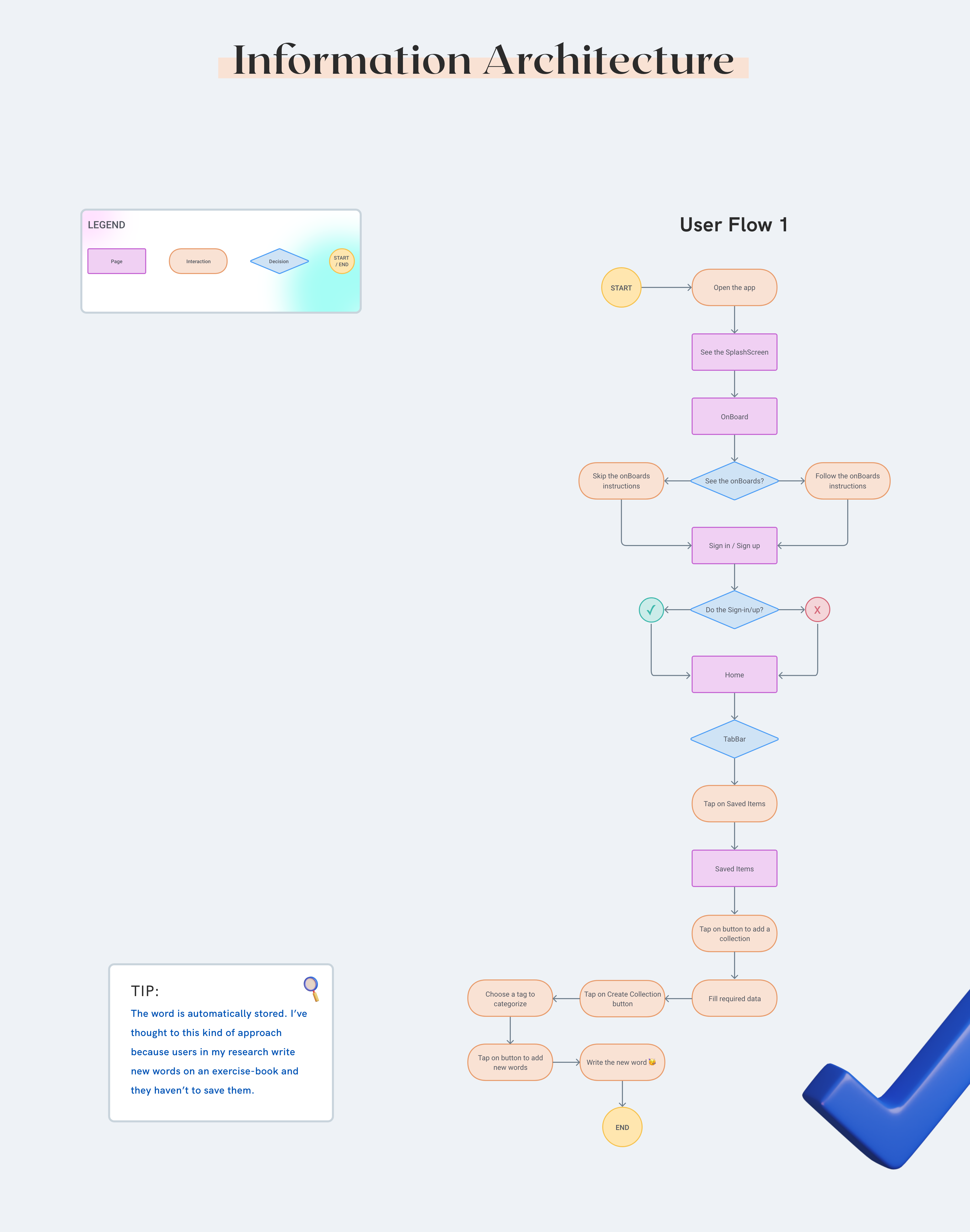
I mapped out the users’ steps into task analysis to see how I could simplify their journey to help them reach their most important goals with the product.
As Andrés (a Sw Developer) I want to write & categorize new words so that I could find them quickly.
Andrés Castillo
TASK 1 – Categorize & Write new words
- Open the app
- See the SplashScreen
- Follow the instructions on the onBoard
- Skip the Sign-in / Sign up (Guest mode)
- Enter in the Home page
- Tap on Saved Items in the TabBar
- Enter in Saved Items page
- Tap the button to add a collection
- Fill in required data
- Tap the button Create Collection
- Choose a tag to categorize
- Tap the button to add new words
- Write a new word
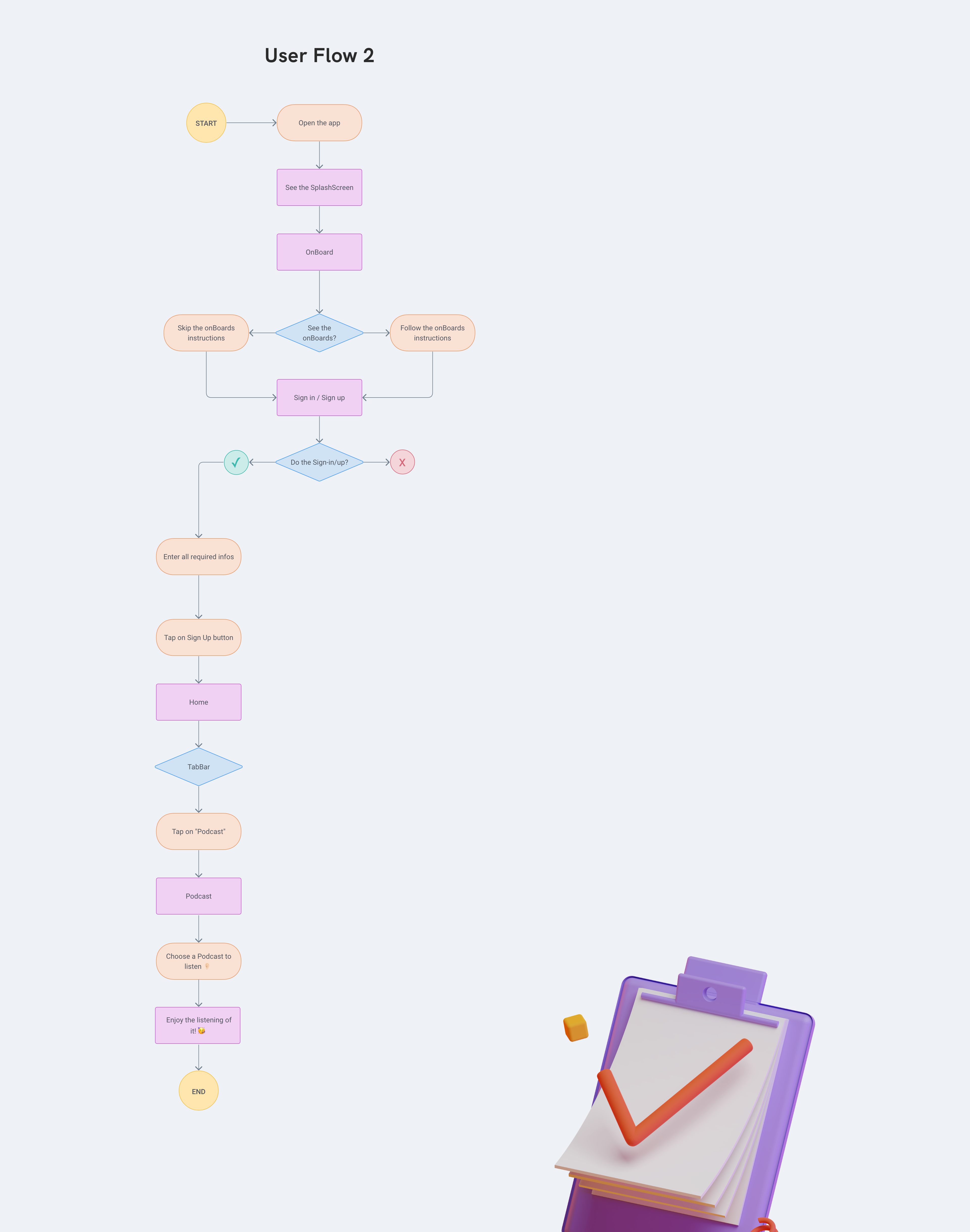
As Andrés (a Sw Developer) I want to improve listening of English so that I could do video-conferencing with Foreign Customers.
Andrés Castillo
TASK 2 – Improve Listening
- Open the app
- See the SplashScreen
- Follow the instructions on the onBoard
- Enter all required infos
- Tap on Sign Up button
- Enter in the Home page
- Tap on Podcast in the TabBar
- Enter in the Podcast page
- Choose a Podcast to listen
- Enjoy the listening of it
Ideate
04 Wireframes
I’ve tried to sketch different versions of my app, brainstorming the best idea to solve the 2 analysed tasks, visually.
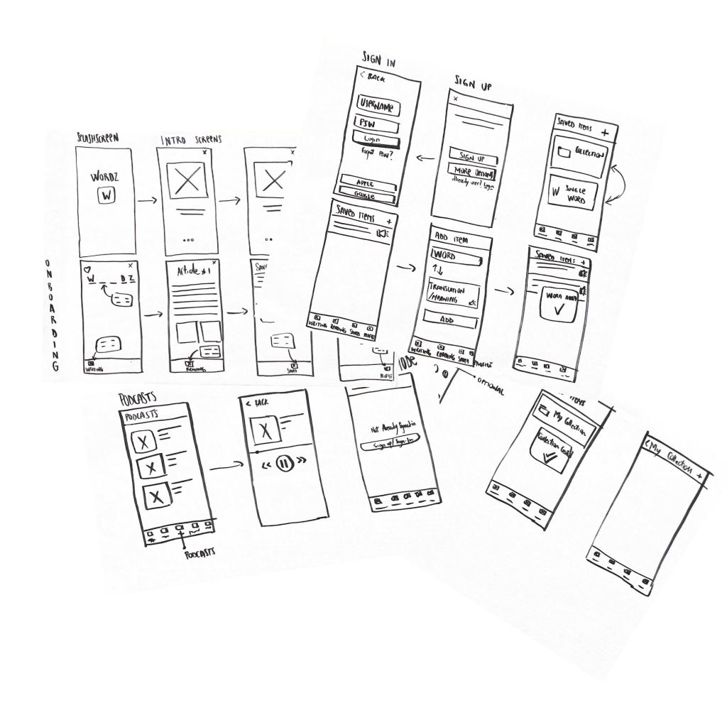
NEW WIREFRAMES
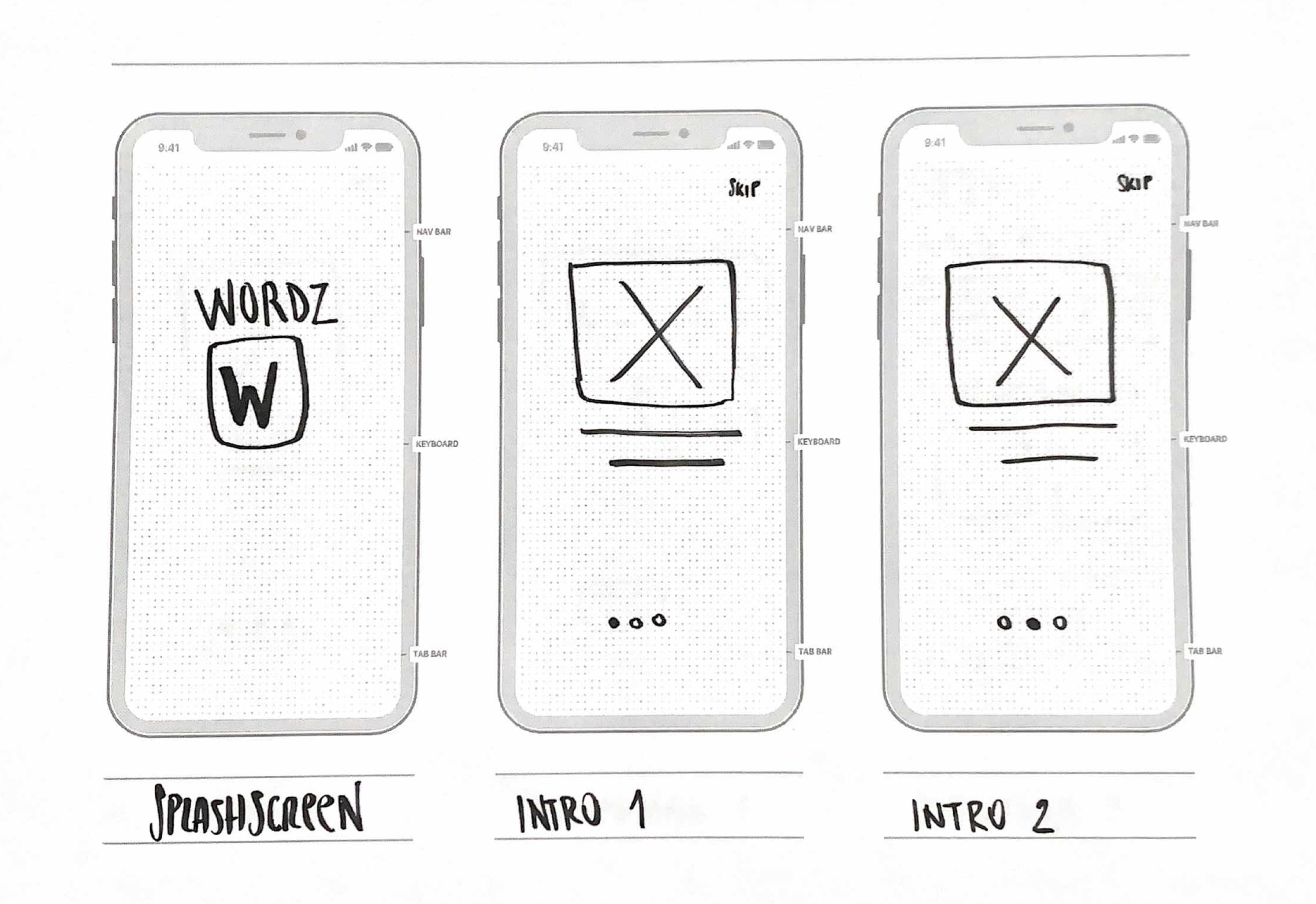
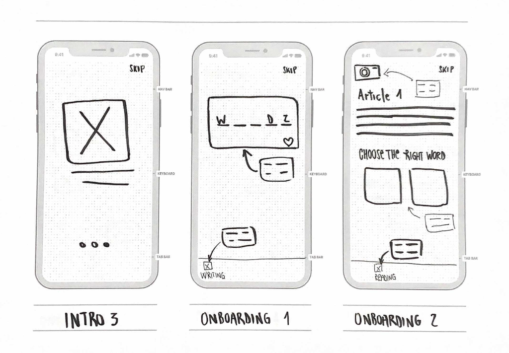
After the first brainstorming phase, I did a new version of my wireframes, which I thought could be more accurate and useful for the next phase, the usability testing phase.
Click here to see the Interactive Prototype done with the Marvel app.
Test
05 Usability Tests
I wrote 5 tasks, 3 Direct and 2 giving the users more context, so a Scenario task and I’ve done 2 face-to-face sessions and the other 3 using skype. I’ve understood during this phase that one of the 3 direct tasks was definitely better with more context. For this reason, I’ve transformed it into a Scenario Task and the last user successfully passed this test, by the way, I reviewed also the wireframes as you will see further below.
DIRECT TASKS
- Don’t see all the instructions. 👉 Switched into scenario tasks
- Listen to Podcast
- Create a new Collection
- Add a new word in that Collection
SCENARIO TASK
- You’ve installed for the first time the app, and don’t want to follow the instructions that usually a new app gives. How will you do this?
- You are a reserved person and prefer to try an app without entering your data, before to sign up and definitely using it. Moreover, you want a better way to study and saving new words / categorizing them. You’ve installed Wordz for the first time and now you want to try it, without entering your data.
I’ve ordered the tasks in this way
- S1
- D2
- D3
- D4
- S5
To see more detail about the tests click here.
Revisions I made
I’ve collected all the issues in a table and grouped them by using Jakob Nielsen’s rating scale from usability standard. This allowed me to prioritise what to fix first.
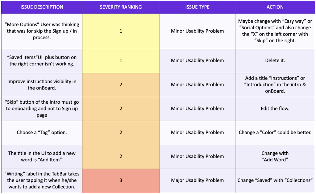
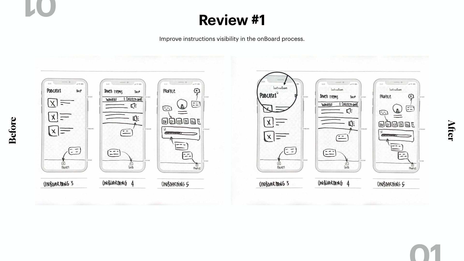
Here, I’ve found my first usability related problem, while a user asked me during the test: “Am I already using it?”, so I’ve decided to add a title for these UIs, giving more clarity to the entire process of the Onboarding.
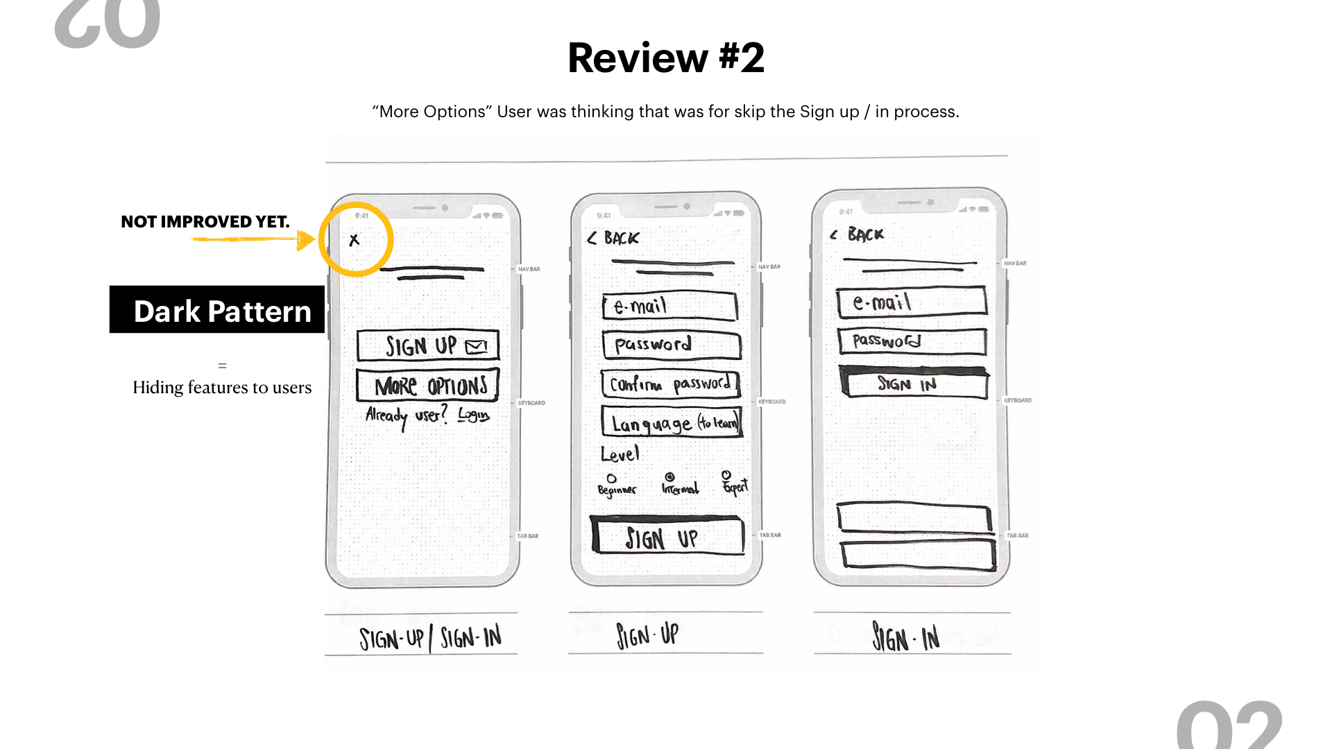
Dark Pattern! It’s not a mistake… but in the field of usability it’s not ethical to practice this and you have to avoid it. Don’t hide features from the user.
I’ve not improved this one yet, but I will do it by changing the position of the “x” in the opposite corner and maybe also changing the x with “Skip”, giving more consistency to my app.
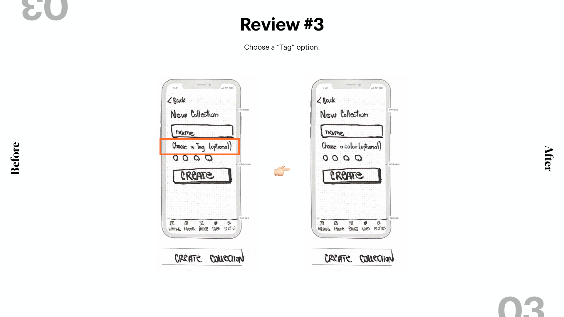
I’ve changed the label from “Choose a Tag”, where the word tag is not familiar to some users, with a new label called, instead, “Choose a color”. In both cases, I provided a default color so that this field will be optional and not required by the system.
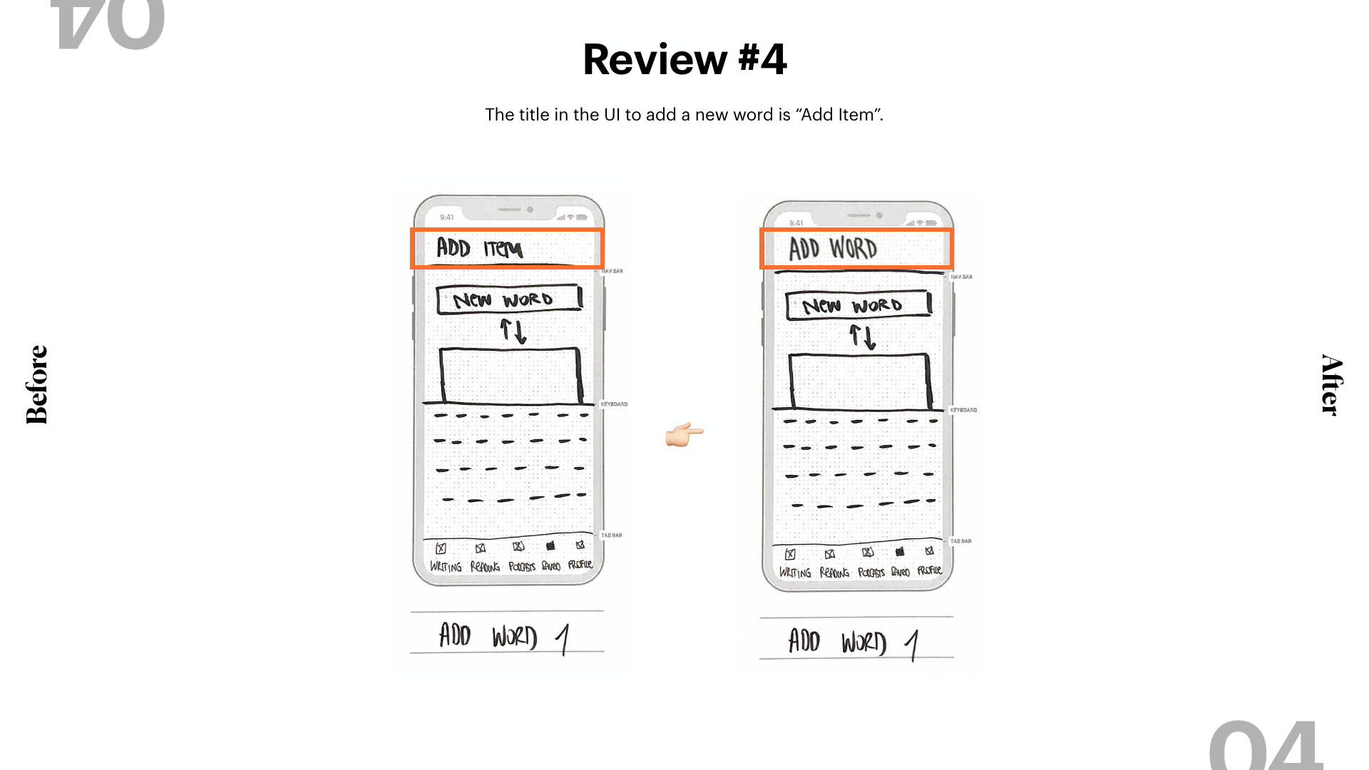
For the same reason, I’ve improved the title here for the same reason. From “Add Item” to “Add Word”, more specific and easier to understand.
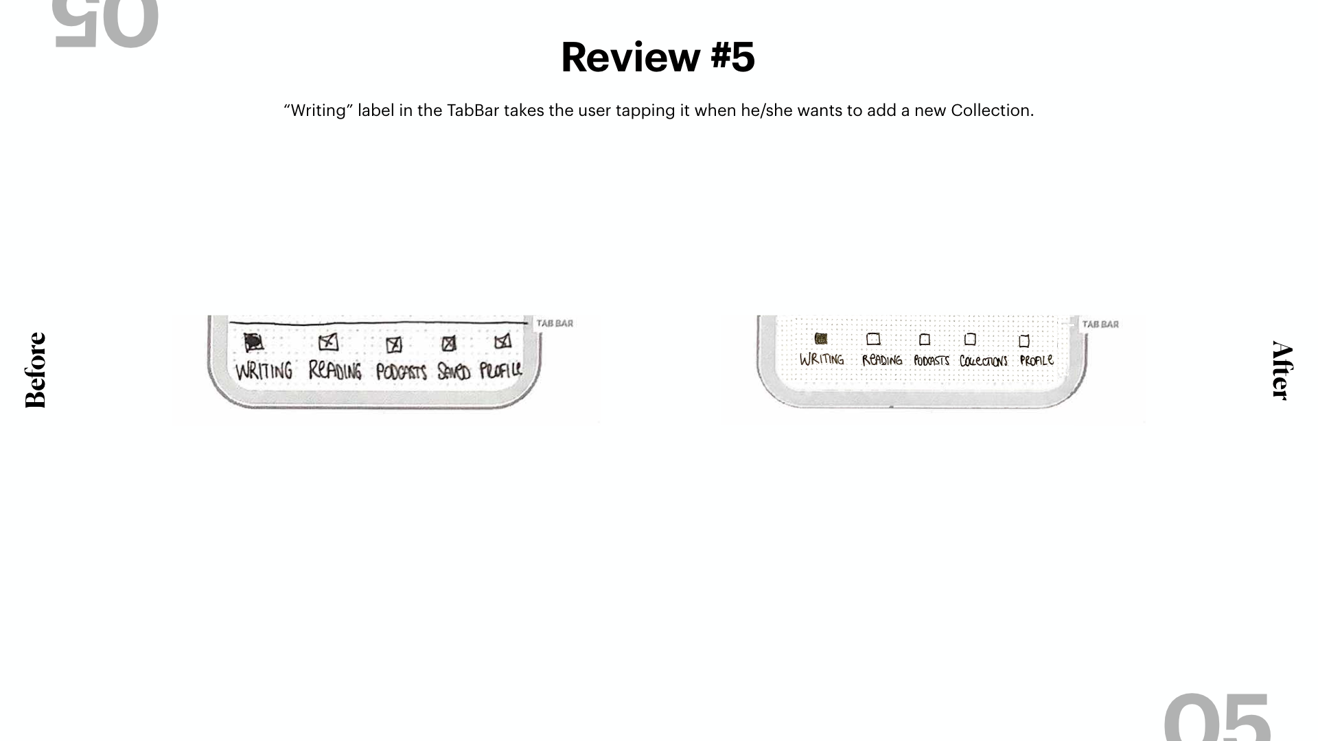
Last but not least, I’ve reviewed the navbar. Maybe there are some changes I’ll do again in the future, but for now, I’ve changed the Saved section with a new Label, “Collections”.
Final Version
🚀 To The Prototype!
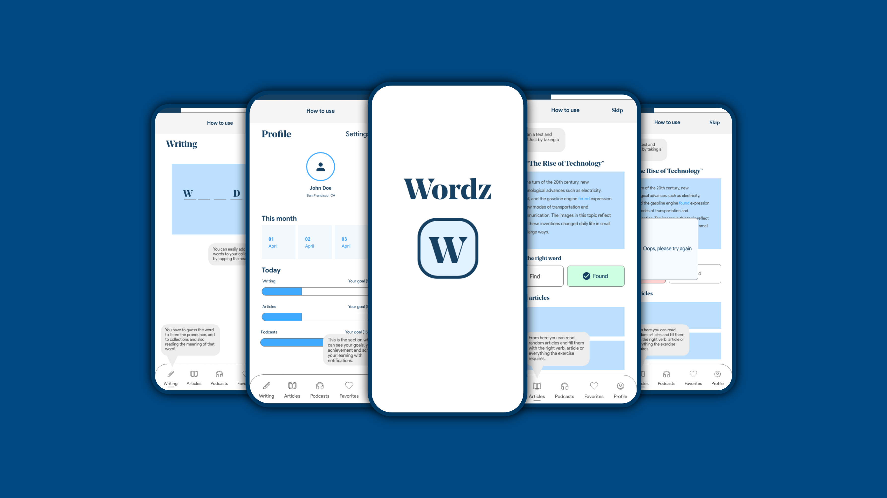
I designed the final version and started to link my designs so that I can have my interactive prototype, with some animations ideas giving a more fun experience to my users.
Retrospective
What I learnt.
- Pay more attention to the written tasks and improve them as soon as possible
- Always put a label during the onboarding process, to let the users understand that is a demo
What’s next?
Take this project to the next level.
- Usability Testing [Iteration #2]
- Improve consistency by designing a Design System
- Hi-Fi Prototype
- Usability Testing [Iteration #3]
- Add new features and improve the existing

